My grandma is a master of crafting. For the past ten years she’s created thousands of cards, extravagant, minimalist, and vintage among other themes, even profiting along the way by selling her products at low-scale to local stores. Last year she decided to massively expand operations into a full business called Decoupage Dreams, which in addition to cards/stationery would sell a full venue decoration service, targeted primarily at weddings but also corporate events.
"Based in Lancashire UK, Decoupage Dreams provides bespoke wedding stationery and venue dressing services in our local community and beyond."

For the past year she’s been building up the business, gaining her first customers, building up a huge inventory/warehouse of products as well as professional development, going to networking conferences and teaming up with business partners.
Seven months ago I started helping out by attending ‘wedding fayres’ with her, something I never even knew existed. Businesses from all across the local area travel to these fayres, setting up booths to show off their wares to prospective clients to-be-wed, namely the bride. As well as attending some networking events, I also did a couple of photography projects some of which was published in a magazine advert, namely Morecambe’s Local Choice.
Around two months ago I started to have ideas about improving the business’ online presence. My grandma’s not tech savvy, so the Decoupage Dreams’s web/social media otulets have suffered quite a bit. With approval, I set about updating social media profiles as well as registering for tools like Google My Business - which gained us a prominent card when somebody in the local area Google’s for us. This helped bring people to the site after they’d seen our work at wedding fayres.
I also started working on a full-scale redesign of the website in the background - the current version was a WordPress installation severely lacking in content. I aimed to change that.
Within an hour I had a basic skeleton app running, with continuous deployment on commit to repo. Within a day I’d designed a reasonable single-page website which contained all the information from the old version (not a lot) and by the end of that day the DNS servers pointing to the new version and the old infrastructure being turned down.
One interesting thing to note was that I used Google Sheets as backing store for form submissions - inquiries are sent there, and email notifications are fanned out from there, allowing action to be taken on new leads. Since we were already G Suite customers, this meant I could avoid paying extra for a database just host a stateless web server.
Here's the script I built:
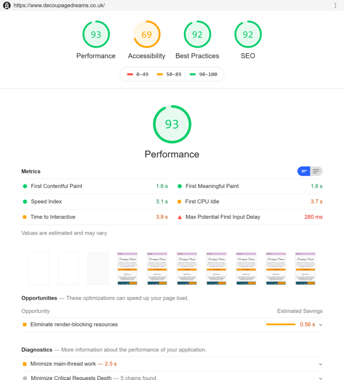
With any reasonably critical project, it’s important to not break things. It’s also important to gain insight into your audience and their use of your site. Setting up client-side instrumentation allowed me to measure metrics such as page views, time on site and bounce rate. I knew what the old website’s conversion rate was going at (anemic by any standard) so used that as a baseline comparison. I also had regular performance measurement using Lighthouse, an open-source tool for improving the quality of web pages.
Since it’s summer and wedding season is coming (usually around June to September) I wanted whatever was out there to be beautiful and functional, even if not fully featured with lots of content. It might not be the best, but it’s better than an under construction page.

Lighthouse allows me to measure page quality across four dimensions: performance, SEO, accessibility and ‘best practices’. Making this tool part of my regular testing/CI cycle meant I could avoid shipping a worse version of the site - even though the chances of a degraded experience really affecting the business, I wanted to keep pride in my work and not deploy garbage to the open web.
Ideally, every page on your site should have one goal in mind:
Landing Pages shouldn’t just generate leads, but "qualified" leads. People who are actually going to turn into customers. Now I’m no expert in managing this, but I think I’ve done a decent alternative here, by asking potential customers what their budget is, allowing my grandma to decide if it’s worthwhile following up on.
View the final page at https://www.decoupagedreams.co.uk/weddings

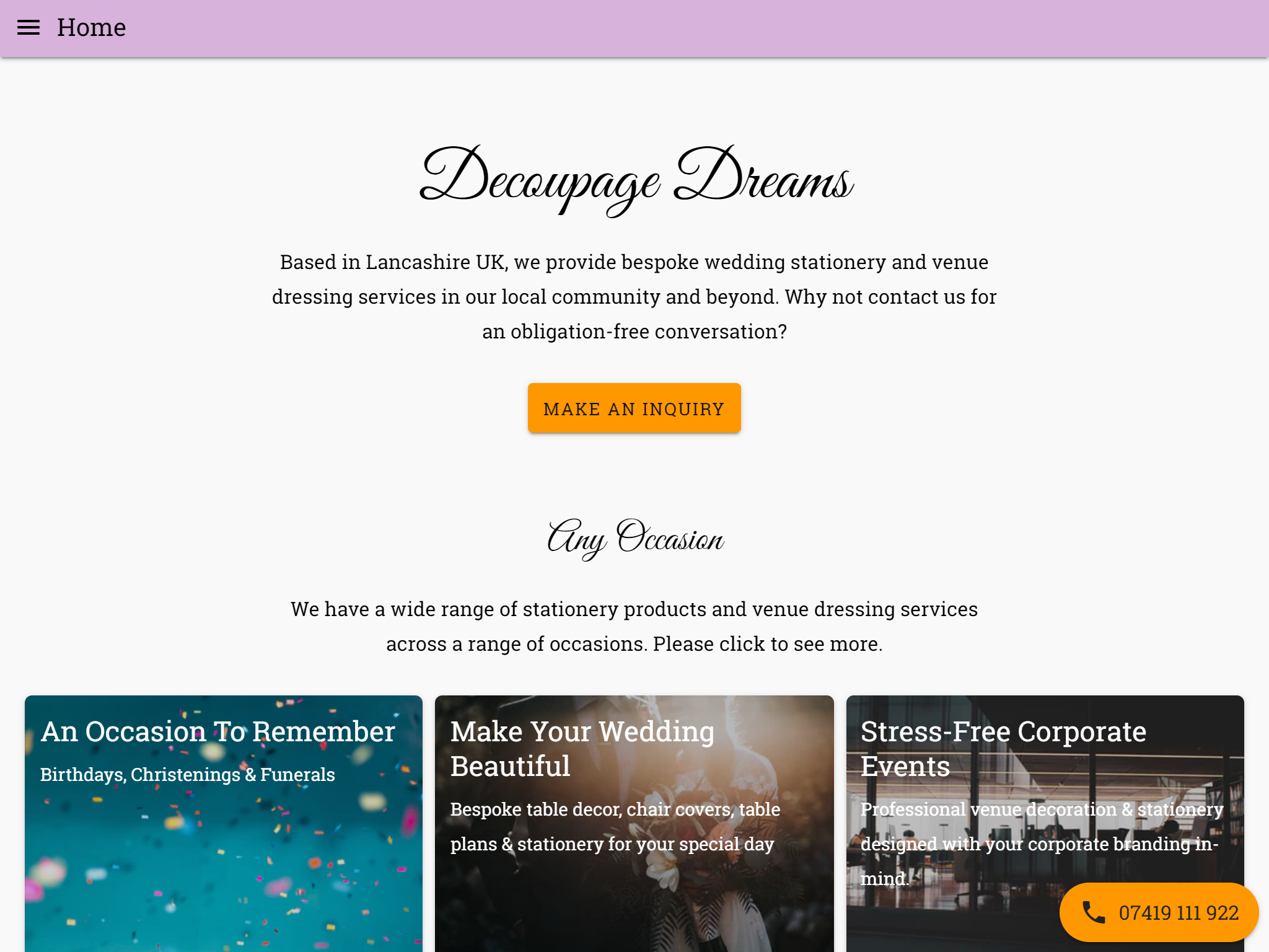
Your Homepage should be designed to get people to the information on your business that they need as quickly as possible. Chances are any visits to the home page will be a response to non-internet-based advertising so you have to be careful not to leak visitors here.
My response to this was to put the three primary business verticals occasions, weddings and corporate events front and centre in three cards. Since direct visits may also indicate general interest in our company, a secondary goal for the homepage was to give easy access to contact us.
The primary CTA was a large button labelled "Make An Inquiry".
I’m a big fan of the floating action button pattern from material design, so I also added a FAB in the bottom right for easy access to phone us. This button only shows up in the daytime.